 http://www.bbc.co.uk/scotland/
This is a standardized choropleth map showing the world's population density per square km.
A standardized choropleth doesn't use boundary lines (such as states or provinces).
http://www.bbc.co.uk/scotland/
http://www.water.usgs.gov
A choropleth map is a thematice map where areas are shaded (or patterned) in proportion to the measurement of the data variable being displayed on the map. This map shows the

http://oregonexplorer.info/craterlake/dlg.html
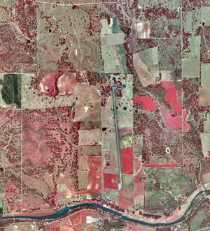
Digital Line Graph (DLG) is a digital vector data map. DLGs contain a wide variety of information depicting geographic features. This image, of

 http://gis.esri.com/library/userconf/proc99/proceed/papers/pap171/p171.htm


 http://start1.jpl.nasa.gov/caseStudies/autoTool.cfm


 http://www.galatime.com/2006/03/05/nifty-volatility-atr-at-historic-lows/

 (This image is only animated when you go to the link found below)
 http://www.soest.hawaii.edu/coasts/data/oahu/dem.html
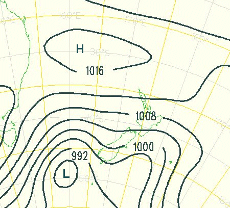

 http://www.cviog.uga.edu/Projects/gainfo/gastat.htm
 http://www.ij-healthgeographics.com

 www.srh.noaa.gov/.../GEMPAK_Q-vectors.html


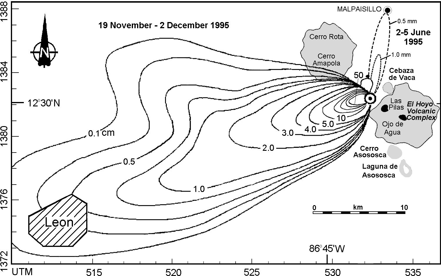 http://images.google.com/imgres?imgurl=http://www.geo.mtu.edu/volcanoes/central_america/nicaragua/cerro_negro/gvn/images/2012neg4.jpg&imgrefurl=http://www.geo.mtu.edu/volcanoes/central_america/nicaragua/cerro_negro/gvn/cerro_negro.v20n11_12.html&h=939&w=1499&sz=172&hl=en&start=5&sig2=uS5BJ7V2PAj6u-pUlqP6fg&um=1&tbnid=jYCyZTJt68LnSM:&tbnh=94&tbnw=150&ei=hqRiSObAHY_eigH28KisAw&prev=/images%3Fq%3Disopachs%26um%3D1%26hl%3Den%26rls%3Dcom.microsoft:en-us:IE-SearchBox%26rlz%3D1I7SUNA%26sa%3DN

 http://images.google.com/imgres?imgurl=http://www.americanforests.org/images/resources/urbanforests/greeninf_1.gif&imgrefurl=http://www.americanforests.org/resources/urbanforests/greeninf.php&h=200&w=360&sz=48&hl=en&start=17&sig2=MfOwLQs8eiZchBofHiR-xA&um=1&tbnid=OqgLY-Rgck6m5M:&tbnh=67&tbnw=121&ei=Ze5bSIrxFJCeiwHs3smLDA&prev=/images%3Fq%3Dplanimetric%2Bmap%26um%3D1%26hl%3Den%26rls%3Dcom.microsoft:en-us:IE-SearchBox%26rlz%3D1I7SUNA%26sa%3DN
 http://images.google.com/imgres?imgurl=http://www.epa.gov/asmdnerl/Library/AnnualReports/2003/fig21.gif&imgrefurl=http://www.epa.gov/AMD/Library/AnnualReports/2003.html&h=381&w=350&sz=37&hl=en&start=6&um=1&tbnid=PhqjQxbqXcDXcM:&tbnh=123&tbnw=113&prev=/images%3Fq%3Dwindrose%2Bmap%26um%3D1%26hl%3Den%26rls%3Dcom.microsoft:en-us:IE-SearchBox%26rlz%3D1I7SUNA%26sa%3DN


 http://images.google.com/imgres?imgurl=http://cache.eb.com/eb/image%3Fid%3D75089%26rendTypeId%3D4&imgrefurl=http://www.britannica.com/eb/art-70823/Histogram-chart-Histogram-showing-chest-measurements-of-5732-Scottish-soldiers&h=310&w=300&sz=9&hl=en&start=136&sig2=vth7Ri3AUr0dsY7hG78g0w&um=1&tbnid=HATa-rB0Mm1F5M:&tbnh=117&tbnw=113&ei=nmksSKjGK4eOigHZ16XoBQ&prev=/images%3Fq%3Dhistogram%26start%3D120%26ndsp%3D20%26um%3D1%26hl%3Den%26rls%3Dcom.microsoft:en-us:IE-SearchBox%26rlz%3D1I7SUNA%26sa%3DN