skip to main | skip to sidebar

Summer's GIS map catalog

Friday, August 8, 2008

lorenz curve


http://www.divisionoflabour.com/archives/cat_misc.php

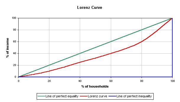
Originally developed for representing income distribution, the Lorenz curve usually shows percent of households vs the percent of income. The Lorenz curve is shown in red, while the "perfect equality" is shown in blue.

Posted by Summer at 12:33 PM

No comments:

Post a Comment

Newer Post Older Post Home
Subscribe to: Post Comments (Atom)

Blog Archive

  • ▼  2008 (49)
    • ▼  August (32)
      • standardized choropleth
      • choropleth map
      • DLG
      • DRG
      • Bivariate Choropleth Map
      • nominal area choropleth map
      • DOQQ
      • similarity matrix
      • correlation matrix
      • star plot
      • Parallel Coordinate Graph
      • portolan chart
      • lorenz curve
      • index value plot
      • triangular plot
      • bilateral graph
      • cartographic animation
      • DEM
      • isobar
      • doppler radar
      • statistical map
      • isopleth
      • isohyet
      • proportional circle map
      • isotachs
      • LIDAR
      • stem and leaf plot
      • PLSS map
      • population profile
      • isoline maps
      • cartograms
      • dot distribution
    • ►  July (3)
    • ►  June (9)
    • ►  May (5)

About Me

Summer
View my complete profile